Mashups with third party APIs are still fun and useful to me, but it’s when people use their own data that things get really interesting. That’s the case with 3rdWhale and its gaggle of green search options.
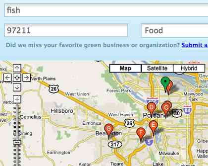
The website takes an address, city, or postal code and returns green businesses in a category you select. You can then find out more information about what makes the business green, such as selling local and organic products.
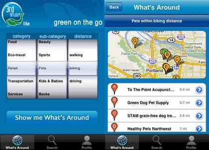
There’s also an iPhone app, which is how I was introduced to the company. The app uses the phone’s location to search for nearby businesses by category and sub-category. My favorite part of the iPhone version is that I can choose the distance based on whether it’s walkable, bike-able, or driveable.
Any web-enabled phone can get in on the game, but it’s not exactly pretty (standard WAP, right?).
The site’s editor, Emily Jubenvill–the “greenest person in Canada”–says that they’re working hard to collect more data. They support 30 cities now. If yours is one of them, check out 3rdWhale. Not only will you find green businesses, but you will also see a great example where the proprietary data takes center stage, with maps and location providing context. That’s as it should be.
In the past I’ve been pretty harsh on the mapping trailblazer, MapQuest. I called them copycats and said they are grasping for relevance. While they aren’t exactly at the top of their game, they’re still trying, and in some cases succeeding.
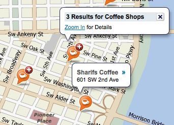
The local interface to add pre-selected types of markers is one of those highlights. It’s great–you can find post offices, parking, gas stations and plenty more. And it’s fast. The part that’s really neat, which shows in the above screenshot, is how MapQuest handles markers that would ordinarily show up too close to each other.
Overlapped and clumped together markers are not very useful without zooming in. MapQuest creates a new type of marker to represent two or more markers. Then, you can click the special icon to zoom in automatically. It makes for a cleaner view, while making it obvious where they have aggregated results.
I’ll probably use a similar system to upgrade my “Where I’m Writing” feature on the site. The area around my house is starting to look clumpy. It shocks me to heap praise upon MapQuest, but this is well done. I’d like to see a tool for something like this incorporated into their API.
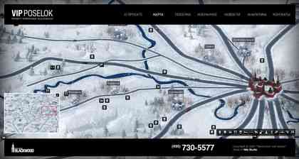
I can’t read any of the labels or other information that shows up when I click this map’s markers. But it sure looks great and appears not to use a mapping API at all. It’s a homegrown (with the help of jQuery) “slippy map” of Moscow neighborhoods.
The same could be achieved using Mapstraction or Google Maps, but the tiles would need to be resized to the standard 256×256. Currently they’re 250×361. Maybe that makes sense in metric.
Via Amber Case, whose Flickr set shows the site in the summer.

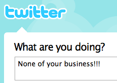
Let’s assume that every bit of content in the future will be easily geo-tagged. That means it will be easily searchable. In turn, messages like the above from Twitter, will be quite easily discovered by the people who are being discussed.
Does that mean gossip will die? Unlikely, but it’s bound to change how people go about it. For most people, having an idea of who is listening alters what they say.
David Stuart gets to the crux of the issue:
“Whilst these comments have always been shared amongst friends, they have never been made so publicly and permanently available.”
Rather than change their ways, users will likely require privacy settings that enable them to only reach their friends. Or, we’ll at least need methods to selectively remove our location.
Or maybe location will kill gossip. But I tend to put my money on technology adapting to users, rather than vice-versa, at least in the short term.
Portland-based location-sharing startup Shizzow took down the Beta sign. Anyone can now join the site and share their location.
I’ve been using the service almost daily since August. Yes, there are other services with similar features, but this is where my friends are. Several times I’ve been in downtown Portland looking for coffee shop co-working and used Shizzow to help me find the hangout-of-the-day.
Plus, Shizzow views itself as a platform first and a site second. Shizzow launched with an API, a feature shockingly absent from data-hoarding Latitude.
While it’s missing the snazzy iPhone app of competitor BrightKite, I’m sure that’s coming from developers. And there’s probably a bunch of cool stuff coming that the small Shizzow team wouldn’t be able to create on their own.
My friends at Wired’s Epicenter blog have a great, solid write-up of Shizzow’s launch.
 I’m working on some mashups for a chapter in the book, including a weather map. So, I was checking out Yahoo’s weather API and came across its codes for specific conditions.
Curious, I started cross-referencing the codes to their icons. Most are able to get across the condition visually. A few, such as dust and fog, require text to make sense of what would just be a picture of haze. Actually, haze is its own condition.
Another that also gets textual treatment is hurricane. But instead of tossing the H-word into a graphic of sideways rain, Yahoo’s icon simply says “WINDY.”
 Seems like an understatement to me.
The data comes from the Weather Channel, but its icon of the same code has no text. And it looks scarier, much more appropriate for a hurricane.
 When you’re plotting locations from a database or matching search results to markers on the map, you may want to add labels. For example, the closest locations on this WiFi hotspot are both listed and plotted, marking spots with numbers. Similarly, Google shows local search results with alpha labels, A-Z.
Previously, you had to download sets of markers. If you needed a marker you didn’t have, you needed to make a new one. Thanks to Google Charts, you can create dynamic labeled markers.
 All it requires is passing the label in the URL. Pretty easy. You can also change the color of the marker and its border. Here’s the URL for the “A” marker:
http://chart.apis.google.com/chart?chst=d_map_pin_letter&chld=A|00CC99|000000
Even better, you can use the markers anywhere you find useful, including other mapping providers. An example of this using Mapstraction is in my book. If you’d like to see it in Google Maps proper, view the source of this sample map.
NPR’s David Greene is in the midst of a 100 day road trip, covering the U.S. economic crisis. He has talked to a restaurateur in Michigan, scoreboard-maker in Ohio and young Georgians about to enter a workforce with questionable options, among many others. So, he’s creating a lot of content along the way. That sort of road trip was just begging for a map component and now it has one.
The feature uses an embedded My Map (above), Google’s map mashup tool. Greene periodically plots his route and marks his current location. As he files reports for NPR or takes photos, he adds special markers with links to the content.
The map has a few rough edges, but overall I’m impressed. I never gave My Maps much consideration because so often I populate maps with dynamic content from a database. For a non-programmer sharing a trip, it gets their map to its destination with a lot less overhead than it would take to custom code.
I’d love to see every roadtripper chronicle their journey in a similar way. I’m looking at you, TumbleWagon.
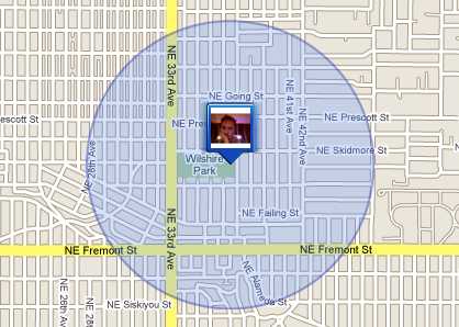
Earlier this month, Google announced Latitude, a tool to “see where your friends are.” To location fans like me, the service itself isn’t that interesting. It’s a watered down version of what others do better. What’s exciting is that Google Latitude is legitimizing a technology fraught with privacy concerns.
Most people, even those usually in the ravenous early adopter crowd, cringe at the idea of sharing their location. There was more than a touch of “I don’t want people to know where I am all the time” in Wired’s recent geo coverage. Reactions to Latitude were similar. PC World gave three reasons not to use Latitude, which all essentially boil down to privacy.
 These discussions about privacy delight me. They need to happen in order for location-based services to move into the mainstream. By releasing Latitude, Google is fast-tracking the process and putting their weight behind sharing location.
For a comparison, look at how social networking has changed within the last five years. Heck, just look at how it’s changed in the last year or even six months. There was a lot of skepticism a few years ago and there has been a lot of talk about privacy since then. Most importantly, there has been a lot of adoption recently. Location sharing will be the same way once we determine the balance of privacy and utility.
Yes, there are plenty of things I wish were different about Latitude. I wish it had launched with an API. I wish there was some other way to share my data outside of the map. I wish it wasn’t so clunky.
It’s certainly not innovative. Most important to me is what it means for the future of location sharing. There is it blazing a trail.
There’s nothing quite like teaching to help you figure out what you don’t know. I’ve been detailing the basics of mapping–plotting markers and adding click-able message boxes. Through the process, I’ve discovered a few holes in Mapstraction‘s coverage of common API features.
For example, there was no method to programmatically close a marker’s message box. You can open it with openBubble, but closeBubble didn’t exist.
Similarly, panning to a new center point, a feature in most mapping providers, was absent in Mapstraction. It’s a nice-to-have, but it sure is less jarring when switching to a point near your current view.
I was faced with the possibility of either leaving them completely out of the book, or implementing them in provider-specific code. Neither seemed like a good solution. So, I set the book to the side and decided to implement them myself.
I’ve been a programmer for well over a decade and I’ve taken advantage of many an open source project. Never before had I contributed code to one. Lucky for me, there is a loyal group of Mapstraction contributors willing to help out a newbie. My “patches” (calling them such is kind, since I merely pasted code into the discussion list) were quickly accepted and are now part of the code repository. Sweet!
Now it’s back to writing. Chapter three is days away from being complete!


 I’m working on some mashups for a chapter in the book, including a weather map. So, I was checking out
  Seems like an understatement to me.
 These discussions about privacy delight me. They need to happen in order for location-based services to move into the mainstream. By releasing Latitude, Google is fast-tracking the process and putting their weight behind sharing location.
 Hi, I'm Adam. I'm writing a book about developing maps on the web. This site is where I'll share the things I find and help you create your own maps.